2024
Personal Project
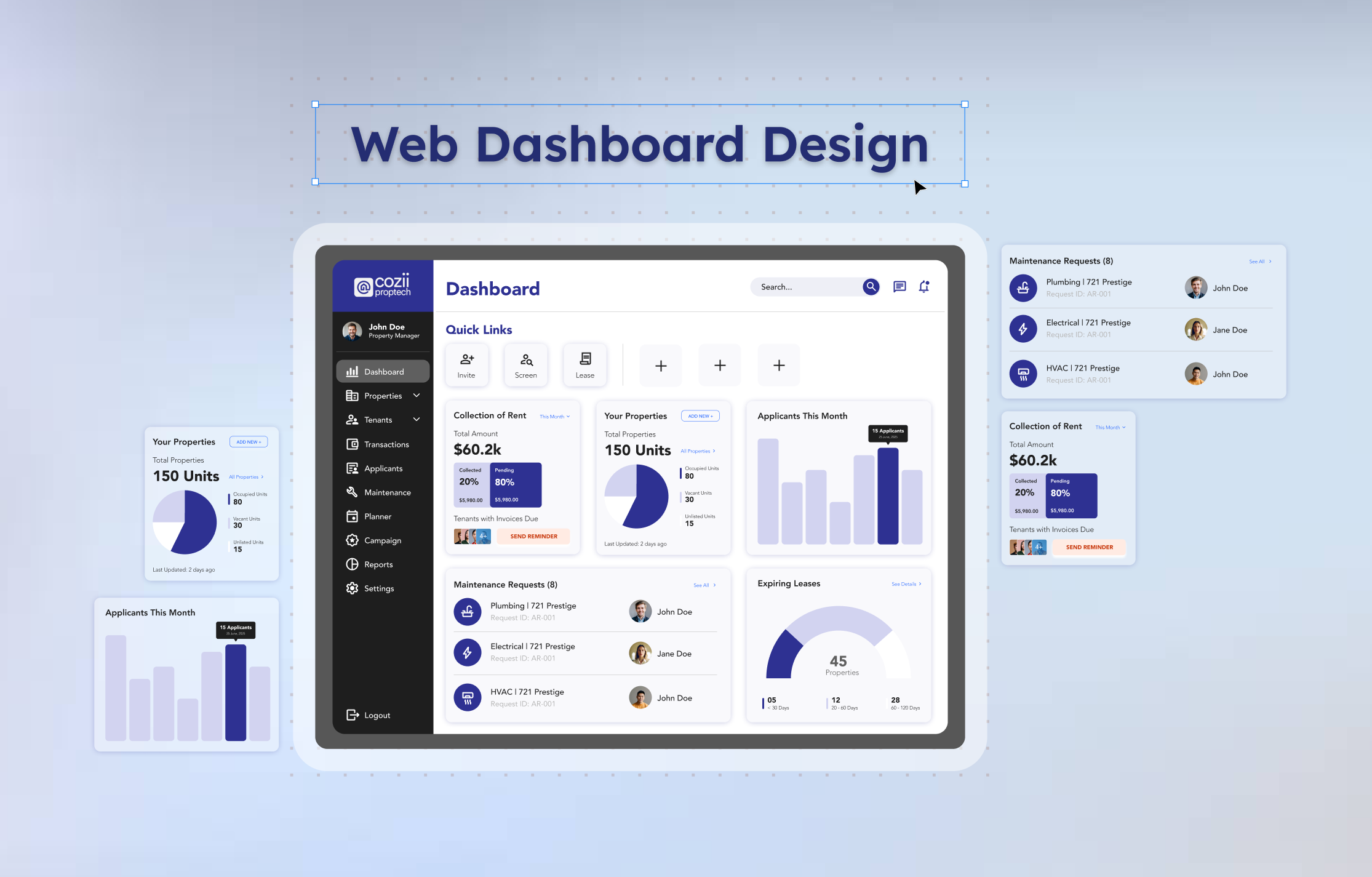
Figma Prototype
Problem Statement
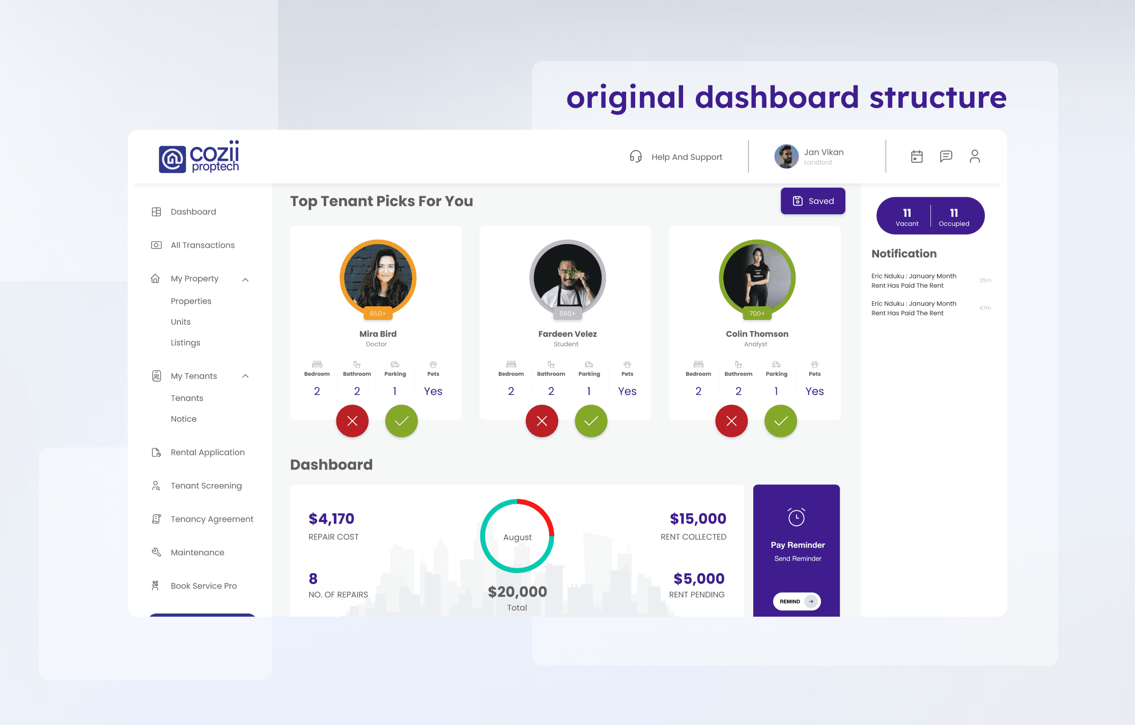
Managing rental properties involves tracking payments, lease expirations, maintenance requests, and new applicants, all at once. Many dashboards used by property managers feel cluttered, overly transactional, and lack a sense of visual hierarchy, making it difficult to quickly surface key insights or take action. I noticed this gap in a sample dashboard from a proptech product and decided to reimagine it through a cleaner, more intuitive lens.
Project Overview
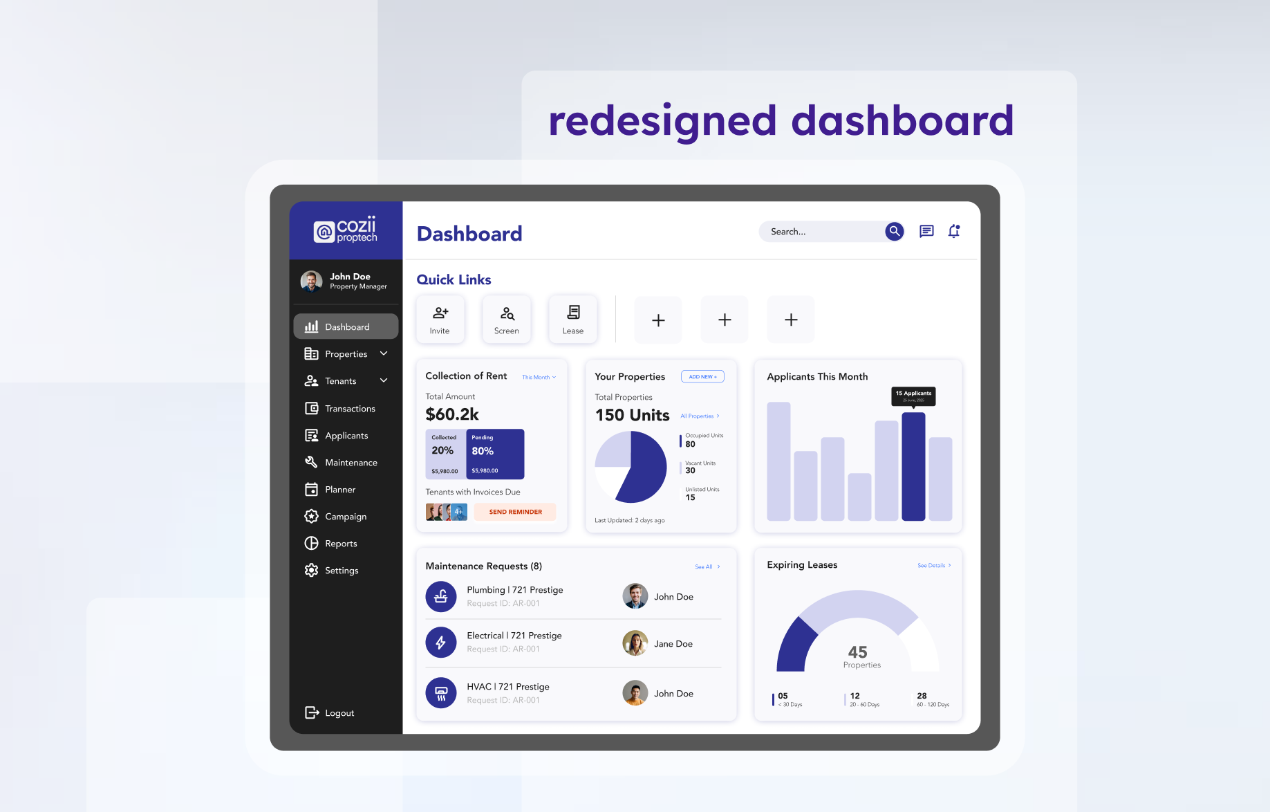
My goal was to modernize the interface, enhance usability, and better support property managers in handling day-to-day operations at a glance. I focused on improving clarity, accessibility, and hierarchy, while preserving the functional essence of the original layout. This redesign repositions the dashboard as a calm, command-center-style interface that’s both actionable and user-friendly.
Exploration and Research
I began by analyzing the original dashboard’s structure, identifying several key usability issues:
No clear prioritization of critical vs. routine tasks
Redundant visual elements and underutilized space
Low contrast in some data visualizations and unclear action flows
To inform the redesign, I looked at modern SaaS platforms and proptech tools like AppFolio, Buildium, and Notion-style dashboards to understand how data density and simplicity could coexist. I also explored design systems like Material Design and used Figma’s auto-layout and component features to prototype layout variations.
Wireframing and Design Decisions
During wireframing, I prioritized:
Card-based layout: Modular cards for each task area, rent, units, applicants, leases, and maintenance, allowing for quick scanning and interaction.
Visual hierarchy: Clear titles, data emphasis through typography and color, and intuitive grouping made it easier for users to focus on what matters.
Action visibility: Key buttons like “Send Reminder” or “Add New” were made more prominent to support quick decision-making.
Refined visuals: I reworked charts to include clear labels and improved contrast, while preserving the dashboard's original visual tone.