2025
Hive
Figma Prototype
Problem Statement
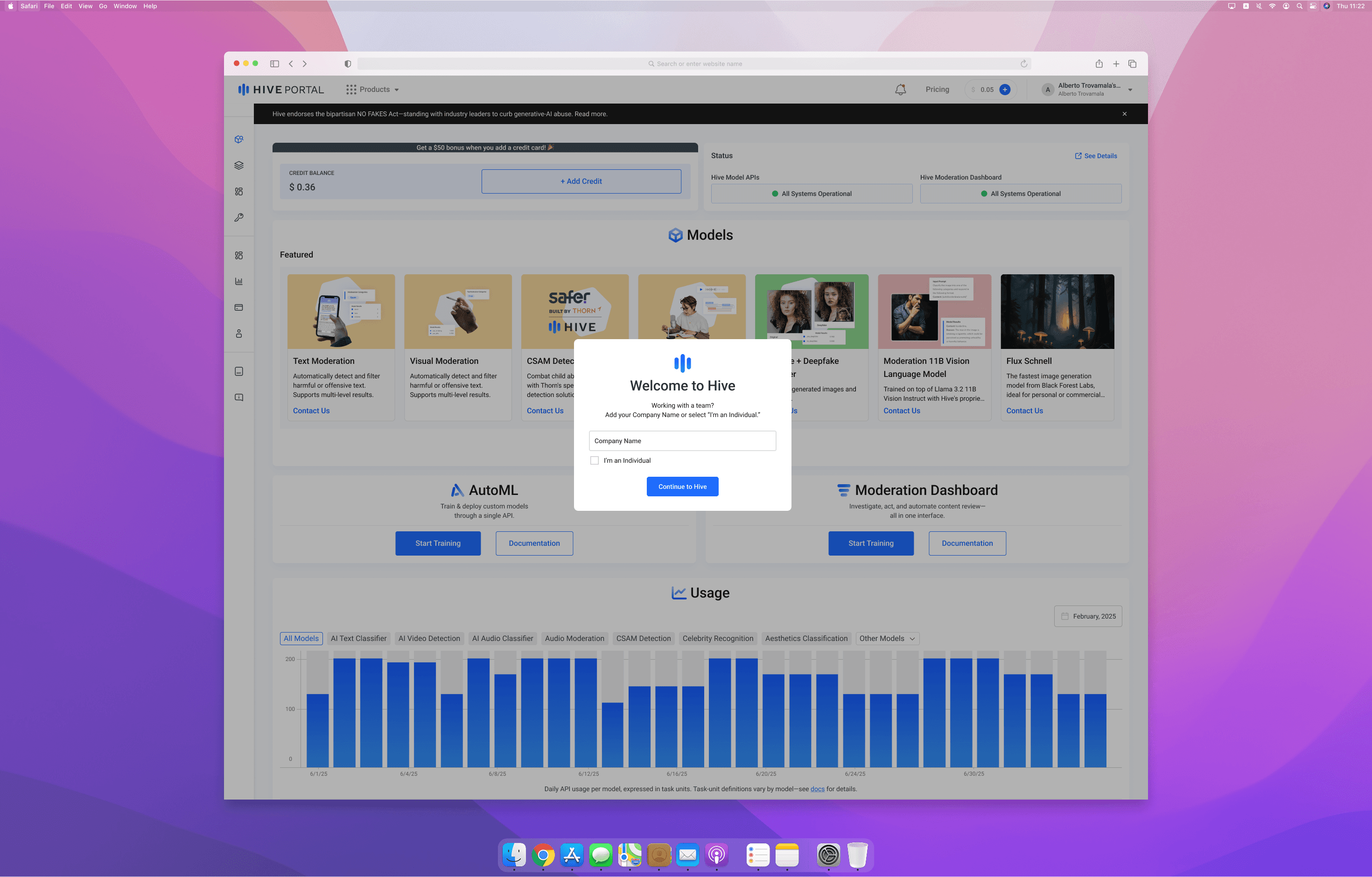
The Hive portal dashboard, the primary landing page for customers, suffered from poor visual hierarchy, cluttered information architecture, and high cognitive load. New users lacked clear guidance after sign-up, leading to incomplete onboarding and slow product adoption. Returning users struggled to find key features amidst the clutter, often bypassing the dashboard entirely. These issues resulted in inefficient workflows, underused features, and missed opportunities to surface critical information.
Product Description
As a Product Design Intern, I focused on improving the first and recurring user experiences through two main initiatives:
Introducing onboarding to better capture user context and guide new sign-ups.
Redesigning the portal dashboard to reduce clutter, clarify priorities, and improve feature discoverability for returning users.
The project involved user research, competitive analysis, stakeholder collaboration, and iterative design aligned with business goals and technical constraints.
Early Exploration
Competitive Analysis: Studied onboarding flows and dashboards of SaaS platforms like Notion and Linear to identify effective guidance patterns and clean layouts.
Heuristic Evaluation: Audited the existing Hive dashboard and sign-up process, finding key issues with hierarchy, guidance, and information overload.
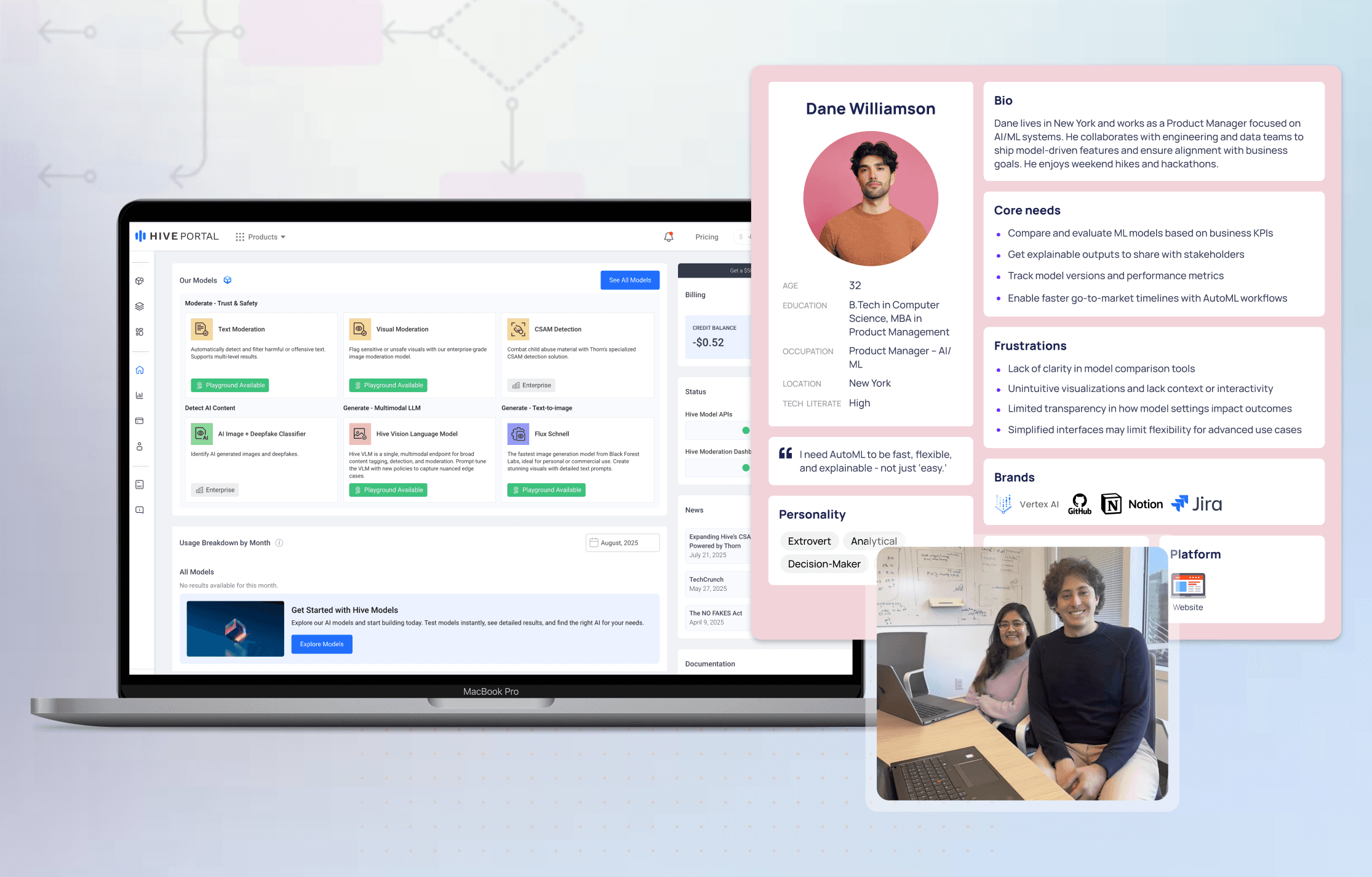
Stakeholder Interviews: Engaged product managers and engineers to clarify priorities, technical feasibility, and success metrics.
Synthesis: Key themes emerged: need for contextual onboarding, decluttering the dashboard, and streamlining user workflows.
Redesigning
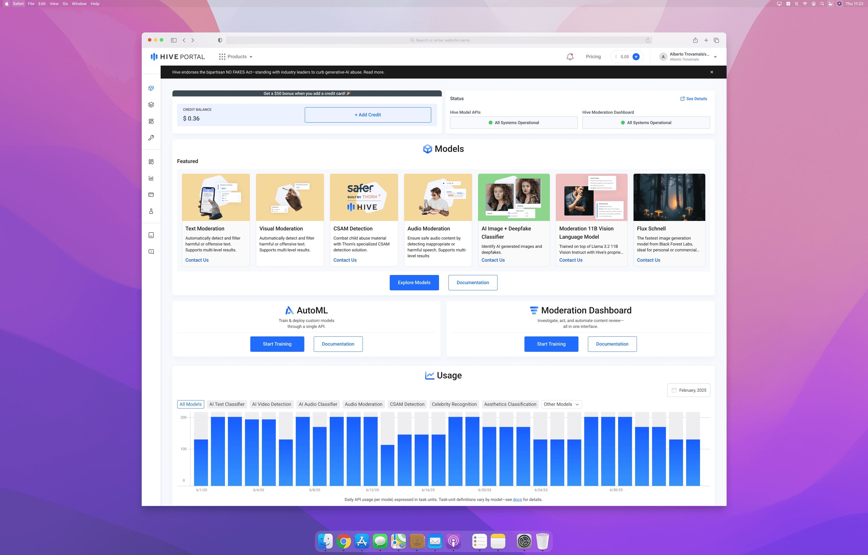
Initially, we planned a lightweight onboarding form to capture user context during sign-up. However, we realized the dashboard’s clutter and noise were the bigger blockers to usability. So, we shifted focus to a portal redesign that:
Reduced visual clutter and organized content to establish clearer hierarchy.
Added a post-sign-up redirect guiding new users to essential next steps, integrating onboarding into the user journey more naturally.
Ensured new designs leveraged the existing design system to minimize engineering effort.
Iterated through wireframes and prototypes, gathering feedback from PMs, engineers, and stakeholders for alignment and feasibility.
Proof in the Pixels
Onboarding Flow: In the first week, ~10% of new sign-ups provided company info via the onboarding prompt, valuable first-party data for targeting and outreach.
Dashboard Redesign: Stakeholders and early users described the new dashboard as “cleaner” and “easier to navigate,” with improved discoverability of key features.
Efficiency Gains: The redesign reduced unnecessary clicks and cognitive load, supporting faster user workflows.
Development Ready: The redesign aligned with Hive’s design system, enabling rapid development with minimal overhead.